
Semla Design System
a solid foundation for design consistency, collaboration, and scalability.

About
I joined Fyndiq as their second designer on deck. When I joined, there was already a Design System (DS) in place utilising Atomic Design principles as a base. However, the documentation and organization of the components was limited and not synchronized with the live website, causing bottle necks in our developing process.
The Semla Design System is a result of improved documentation, organization, and definition of components. Today we can deliver more consistent, designs that contribute to a more cohesive user experience,
My Role
I am in charge of updating all the existing design components in the Figma file and making sure they are in parity with the actual code on the website. I also design and define new components when needed for new features and updates on the website. Currently, I am in the process of documenting everything in Zeroheight.
The Team
- Product Designer
-Sr. UX Designer
- Front-end Engineer Team
Old state of the Design System
One of the main challenges that I encountered when designing and using the design components was the inconsistency between the Figma file designs and the live website.
It was hard to know which components were already implemented on the website and how to use them for my designs. In this project, I set out to reorganize the entire design system. That involved increasing our influence on implementation, creating proper documentation, and synchronizing our work better with the developers.

Fyndiq’s first design system (before I joined Fyndiq)
Learning the basics of a design system
When I started, I had little to no idea how to organize all the components. Fortunately, there are many open source design systems, like Shopify, Altassian, and Material design, that have served me to learn from, and take as inspiration.
Key improvement points:
After reading and learning from other design systems it was clear that we had to reorganize everything and decide a place where everything could be documented. Following are the main areas for improvement of our design system.
-
Documentation of the foundations of our DS: Such as colors, typography, and spacing.
-
Find a way to keep track of the components’ status
-
Clear documentation on how a component should behave and be used
-
Visualize the specifications of every component
Design iterations
Documentation and status keeping
Since we were already using Atomic Design, I continued using the principles as a reference. I started by writing an explanatory text on Atomic Design and how we should leverage it at Fyndiq to develop our own DS. Then, I documented all the existing components and linked them to Figma.

Notion documentation of our design system
In Figma, we created separate pages for every Atomic Design concept, i.e., tokens, atoms, molecules, organisms, and templates. Each page contains detailed documentation and specifies how every component should be used.

Top: documentation of some our atoms
Bottom: documentation of our interactions
Additionally, I created a table in Figma where we could keep track of the status of our components. I divided them into five columns: Component Name, Design Status, Storybook Status, Production Status, and Comments.
Using this table as reference, we started having design-system meetings every week with the developers to discuss the status, prioritize component, Q&As, and other topics related to our DS.


Table to keep track of the status of our components
Current state of the Design System
One of the biggest challenges when working with a design system is to make it scalable while maintaining simplicity.
To address this challenge we have came up with several improvements:
-
We incorporate usability, accessibility, and coding best practices into every component to enable ease of use and learning for designers and developers
-
We utilize dynamic documentation tools like Storybook, Chromatic, Figma, and Notion to establish clear guidelines and allow experimentation
-
We have created clear communication channels to discuss DS related topics
-
We have set up transparent workflows for using the system

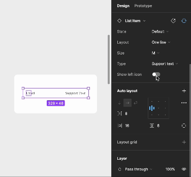
Left: List item component in storybook
Right: List item component in Figma
We refined the status table. We now include all the states and variants of every component with their respective status.

Updated table of the status of our components
I put extra focus on the documentation, as I have realized that documentation is key to successfully implement the components.


Examples of a component ready to hand-off to the dev team

Latest components' status table
Figma constantly release updates to help bridge the gap between designers and developers. It comes with its pros and cons as I have to constantly learn and update how to work with Figma to keep up with the updates, when we are still not in that maturity level. On the other hand, it does keep the flows and designs easy to use. Currently, I am working on adapting the components to the latest Figma version update; Variables, Conditionals, and Dev mode.
Next steps
-
The design system is still being developed. We still have some components that have not been updated in production. However, we now have a clear overview and documentation on what is left to do and what is needed to implement it
-
Our main objective is to implement on the website all the missing components and have 100% synchronised Figma files with the live website
-
We want to include tokens, CSS classes, and code snippets directly to the Figma file to use the same naming conventions in Figma and the code
-
A design system is never finished. It should not be built to last indefinitely but be designed to evolve and adapt. We need to constantly update and keep up with our user needs and the product development,
Key take-aways
-
Collaboration is key: As a designer, it is important to understand how the development team works. and implement the components to find best way to improve our workflows and onboarding.
-
Keep learning: As tools keep evolving and improving, it is important to keep ourselves in the loop and find ways to improve our current ways of working.
-
Ask and get frequent feedback: It is okay to not know everything. I have learned to not be afraid of asking questions and get feeback from the developers in regards of how would they implement a component, or how do they think we should work. At the end, the main objective of working with the DS is to make our workflows better.